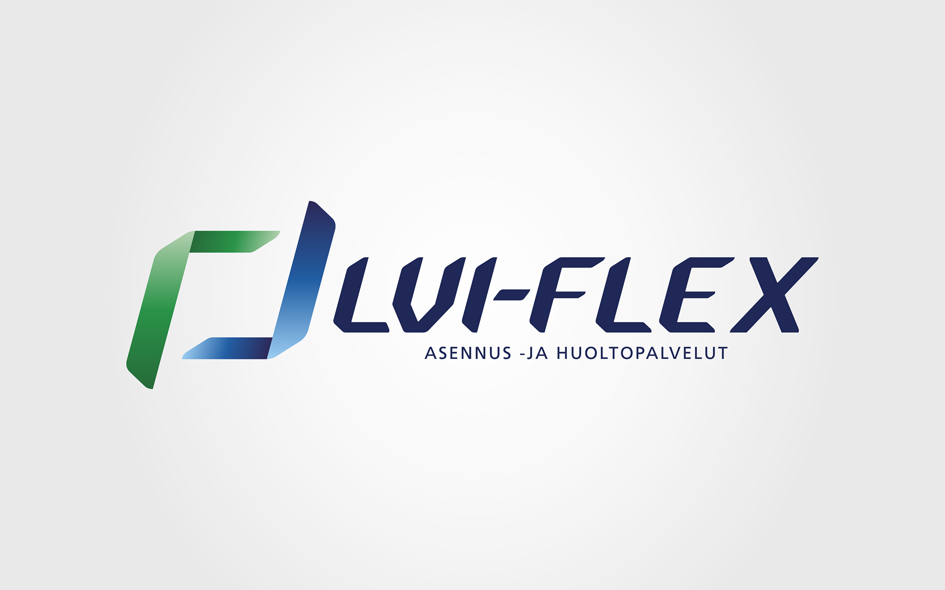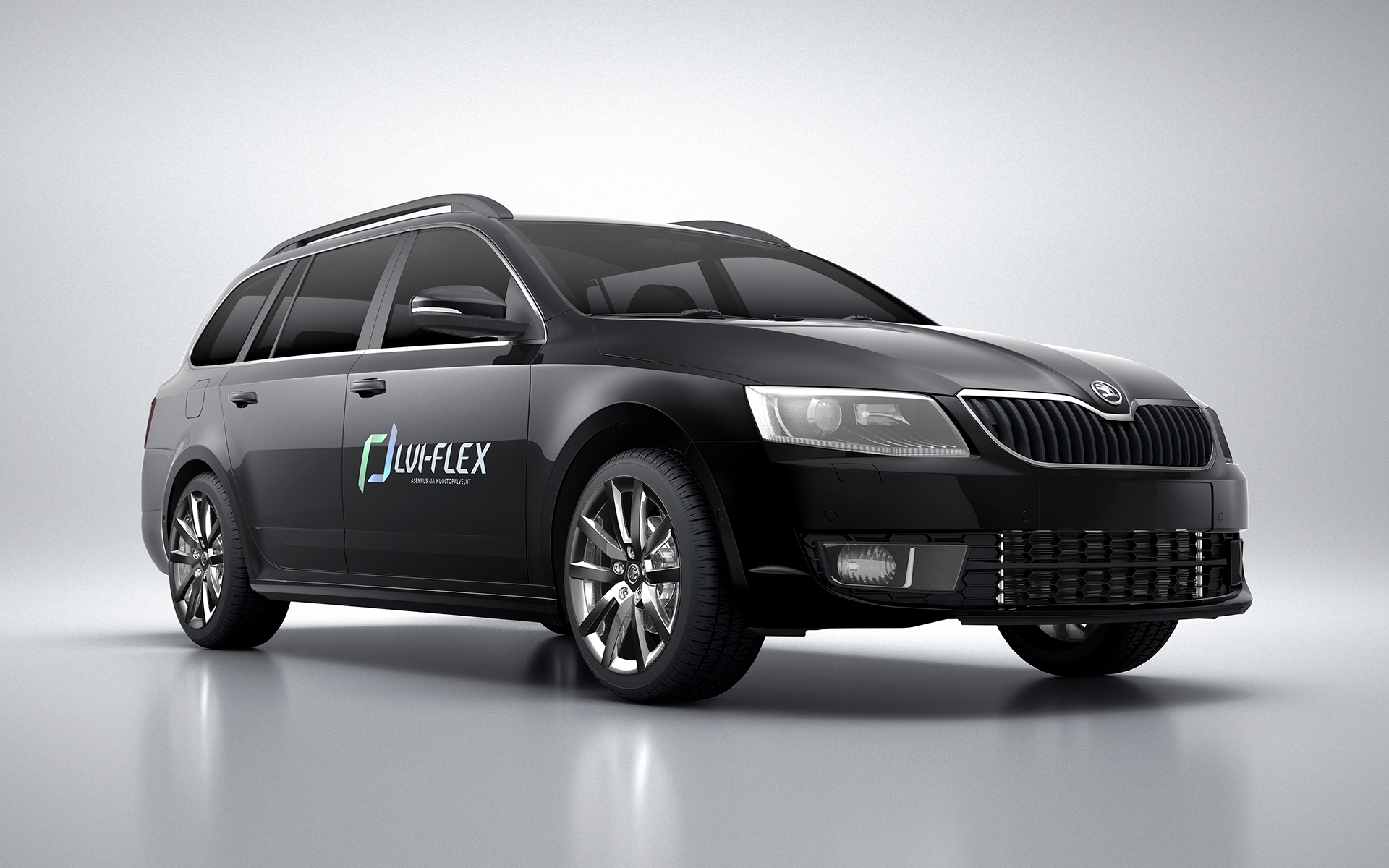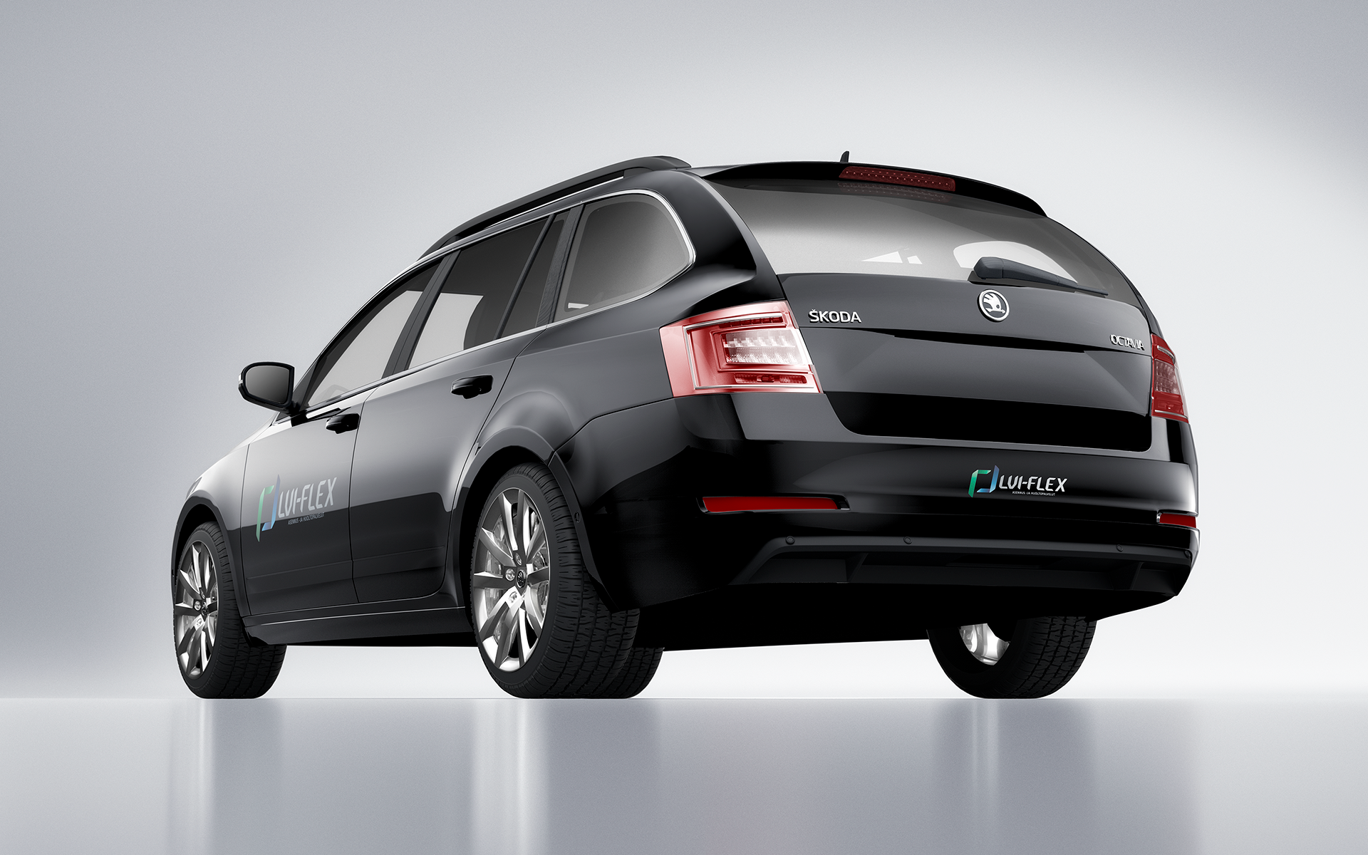


Following the success of my previous VHAC assignment, I was asked to design the creative concept, which included - besides the usual elements of such projects - the company name, a unique typeface and the company logo. Flex stands for flexibility of solutions and support that a small company is able to provide, while Flex is also referring to the bent shape of pipes being laid during the installation work. How to communicate the values? An abstract visualization of the pipes, inspired by CAD-drawings, which are interpreted into 3D reality during the installation. I wanted to incorporate the 2D starting point and the mentioned works into the logo with a slight 3D look. The bending shapes were also transferred into the company typeface. The end result: coherent and competitive look of a modern VHAC company with main focus on small house projects. Disciplines: Identity, Branding, Composing, Retouching, 3D -design Finland, 2018
