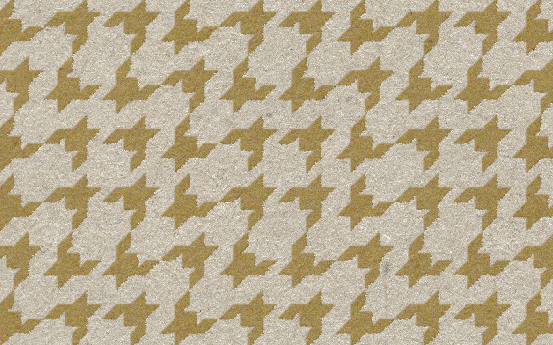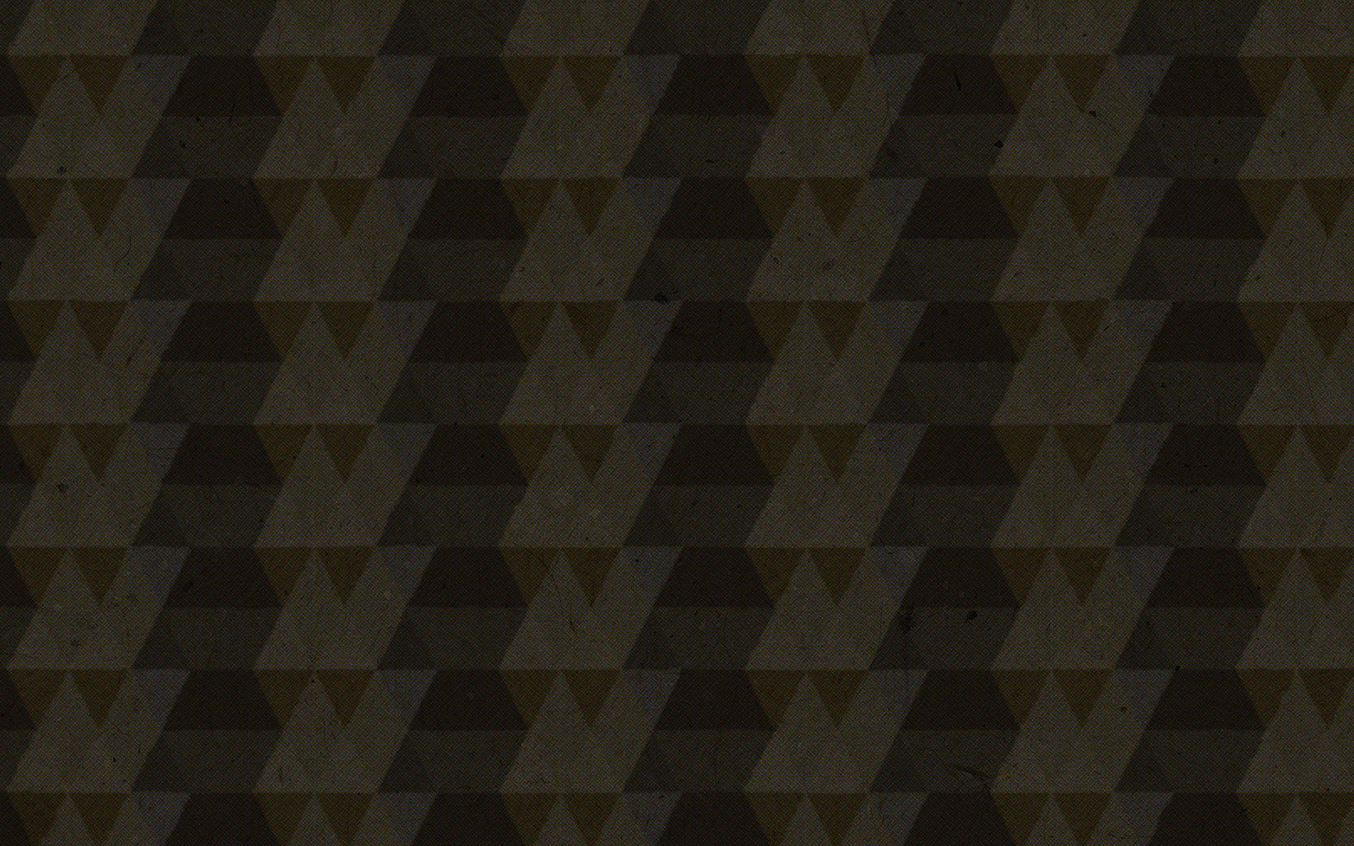

When you suddenly find yourself in foreign country, Switzerland this time, what do you do? Of course you compare your origins to new and exciting surroundings and try to find the common element. I was amazed by the pristine nature and it only felt natural to use it as a source of inspiration. We Finns have deep rooted love to crispbread and it felt as a connection point between two countries. I wanted to design something that reflects on our two nations and so I created the Scandinavian-Swiss combination of simplicity and high quality. I repositioned the humble crispbread to the top shelf with the new premium look. The keywords are modest and honest. Simple and good looking, not promising more than what it is: a basic element of everyday diet. The pattern consists of 2 elements: the soil (brown) and the crop wheat (gold), and the shape reminds of classic geometric designs of Scandinavia. Disciplines: Art Direction, Concept design, Product design, Packaging design, Identity, Composing, Retouching, Branding, 3D -design Switzerland, 2018

