Concept work for Finnish aqua vitae, which draws its inspiration from bygone eras.
Imagine when Dr. Jones was more than a pile of dusty bones and Zeppelins actually took you to heavens. That’s where Captain Hömpsy lives, in the golden era of traveling and adventure.
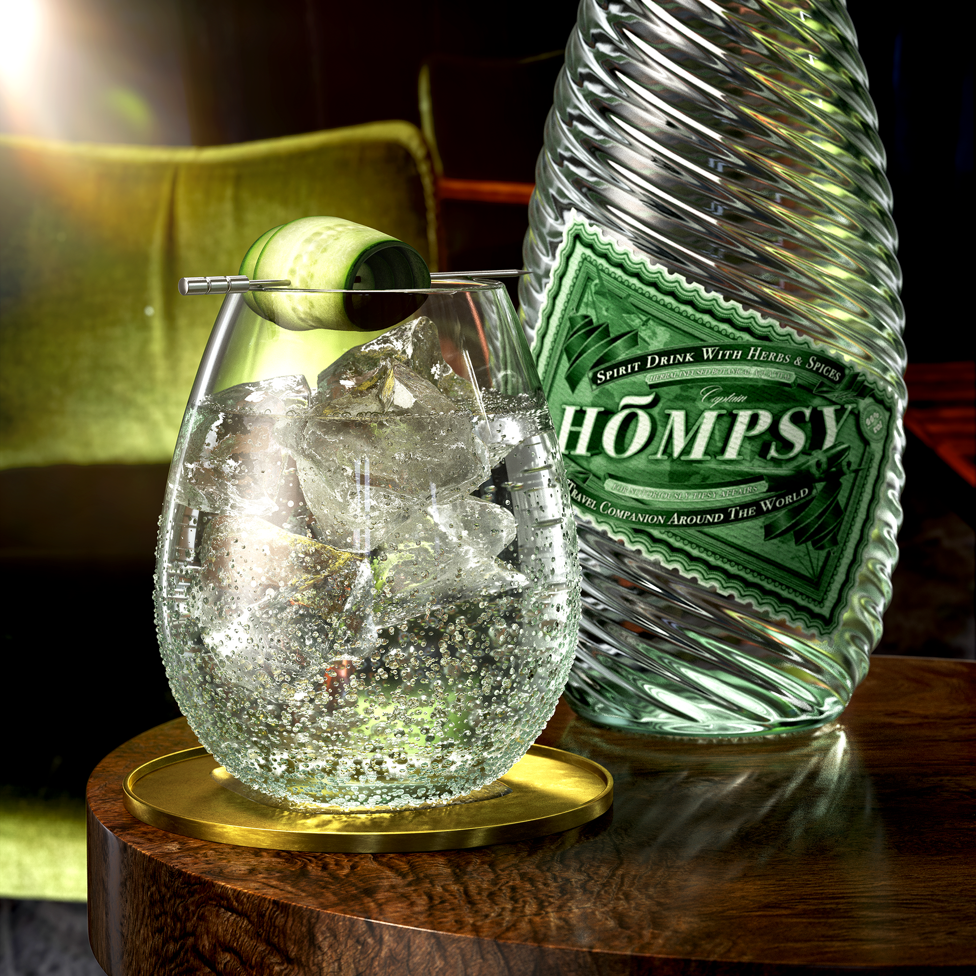
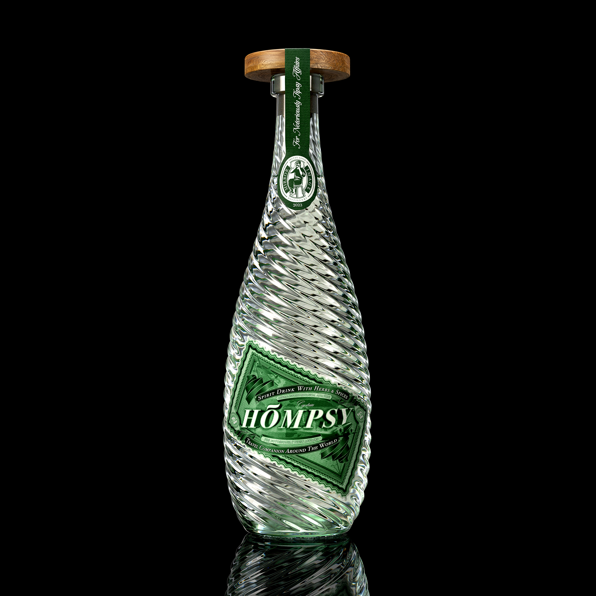
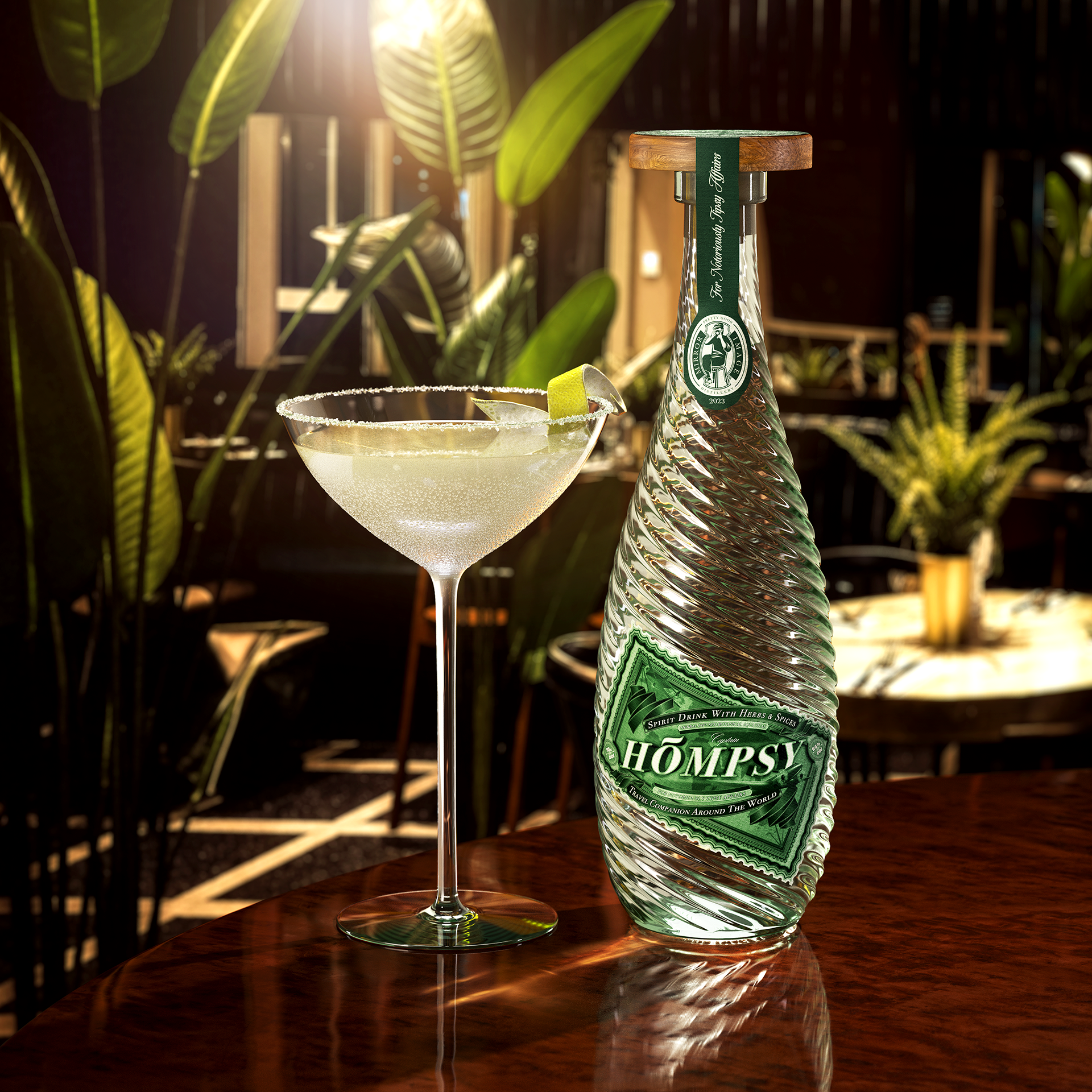
“Hömpsy” is a Finnish word for a quick drink, a sip taken directly from the bottle. The name was chosen for its playfulness and catchy tone. The labels are rich in detail, designed to resemble banknotes. They have a unique perspective view to further strengthen Captain Hömpsy’s adventurous spirit: one can actually sense the plane taking off to the next quest.
The bottle is shaped into a form of a water drop. Its decorative embossing pictures liquid flowing through it, hence the content aqua vitae. It is slightly tinted to match the green color of the labels.
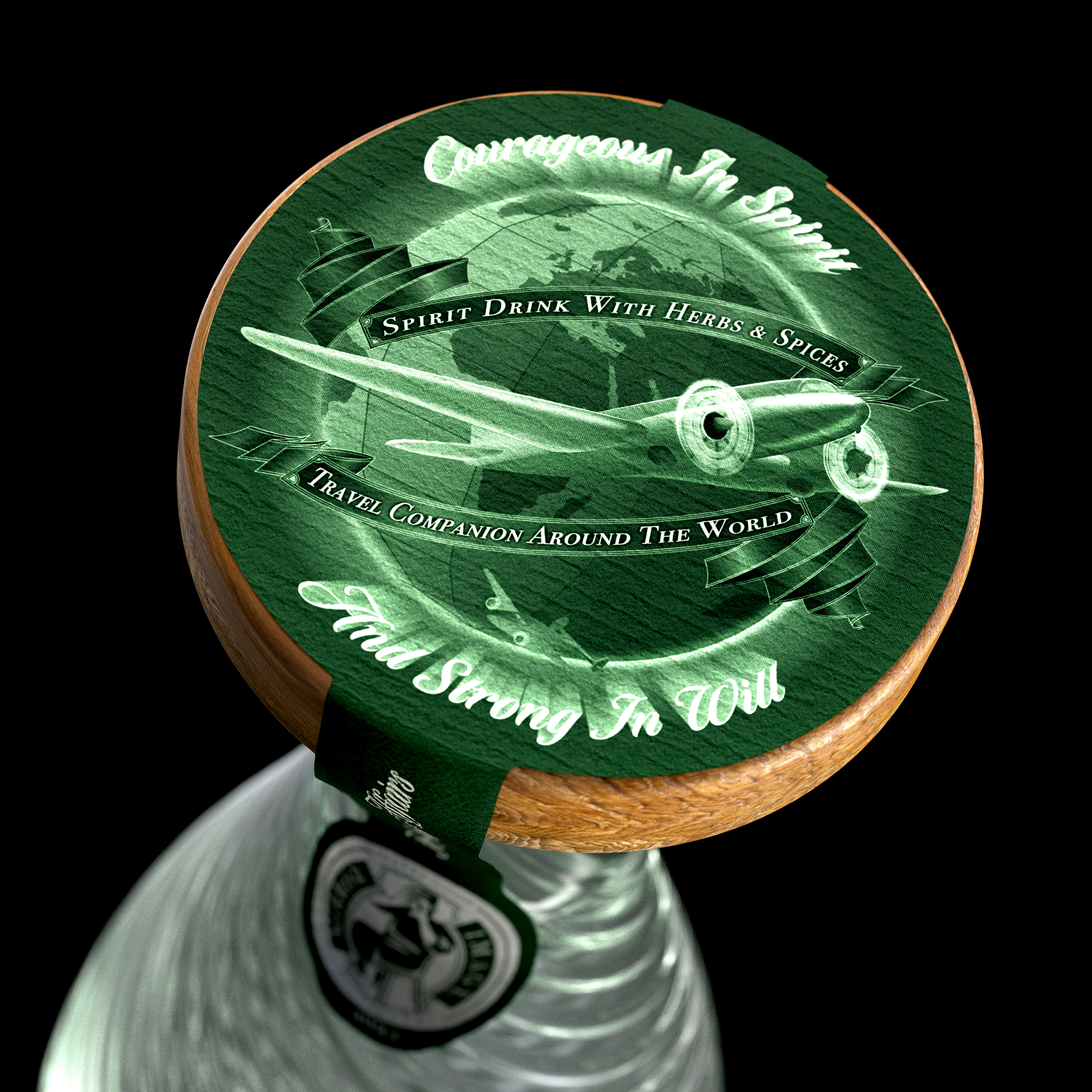
A hidden gem lies underneath the secondary label, a fully functional sundial. After all, it’s always five o’clock somewhere…
Courageous in spirit and strong in will, indeed!
Featured in:
TOP 50 packaging's of 2023 in the Packaging of the World
TOP 10 packaging's of July 2023 in the Packaging of the World
Curator’s Insight from The Packaging Of The World
The real magic lies in the bottle itself. Shaped like a water drop, it embodies the pure and refreshing aqua vitae within. The decorative embossing creates a mesmerizing effect, almost as if the liquid is flowing right before your eyes. It’s like experiencing the spirit of adventure with every glance!
But wait, there’s more! Can you believe they’ve hidden a fully functional sundial under the secondary label? It’s like discovering a hidden treasure in the depths of the bottle! Timekeeping has never been so whimsical and adventurous.